
Project
Comprehensive Data Analysis and Visualization in R: Cleaning, Preprocessing, and Statistical Insight
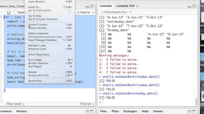
This project showcases a complete data analysis pipeline executed entirely in R, focusing on structured data cleaning, preprocessing, transformation, statistical exploration, and visualization. It is designed to simulate a real-world analytical workflow, commonly applied in health, business, and social science domains. Project Objective: To transform a raw dataset into a clean, well-structured, and analysis-ready format; to conduct meaningful descriptive and inferential statistical analysis; and to present the findings visually using reproducible R workflows. Tools and Packages Used: Core R tidyverse (dplyr, tidyr, ggplot2) lubridate for date-time formatting janitor for cleaning column names and tables gtsummary and gt for statistical reporting and customized summary tables Key Activities and Methodology: Data Cleaning & Preprocessing Inspected structure, types, and missing values Formatted inconsistent date and time entries Removed duplicates, handled outliers, and imputed missing values Recoded categorical variables and standardized measurement units Data Manipulation Grouped and summarized data using dplyr::group_by() and summarise() Applied joins, filters, and reshaped the data using pivot_longer() and pivot_wider() Created derived variables to support custom analysis (e.g., age groups, binary outcomes) Exploratory Data Analysis (EDA) Generated univariate and bivariate summaries Explored distributions, correlations, and key trends using ggplot2 and summary statistics Applied conditional filtering to isolate key segments of interest (e.g., by age, gender, location) Statistical Analysis Conducted hypothesis testing (t-tests, chi-square tests) Computed confidence intervals and p-values for group comparisons Used logistic regression or linear modeling depending on the problem Structured results into publication-ready summary tables using gtsummary Data Visualization Created bar charts, histograms, box plots, scatter plots, and line plots Designed multi-facet and theme-customized plots to highlight differences and patterns Annotated visualizations for stakeholder clarity and interpretation Outcome: Delivered a fully cleaned and transformed dataset ready for advanced modeling or reporting Identified key statistical relationships and group differences Communicated insights through both statistical summaries and intuitive visualizations Conclusion: This project reflects strong proficiency in R programming for data analysis workflows. It demonstrates end-to-end capabilities from raw data ingestion to insight communication, supported by statistical rigor and clean, reproducible code. The methods used align with best practices in public health research, business analytics, and academic reporting, making the work adaptable across various domains.
Resources